Data and Control Types
When designing a Stipa Data Collection Protocol, an important decision is determining what type of data entry control is most appropriate for a particular measurement or observation. A control that accepts any value may be useful for some attributes, such as a description of how to navigate to a study area, but in other cases you may want to limit the values that can be entered.
Each attribute that you add to a protocol must be assigned a data type, and the data type determines the type of control that is displayed during data entry. Nine data types are available to choose from (Figure 1). These include Text, Number, Boolean, Date, Time, Calendar, Category, Photo, and Geometry.
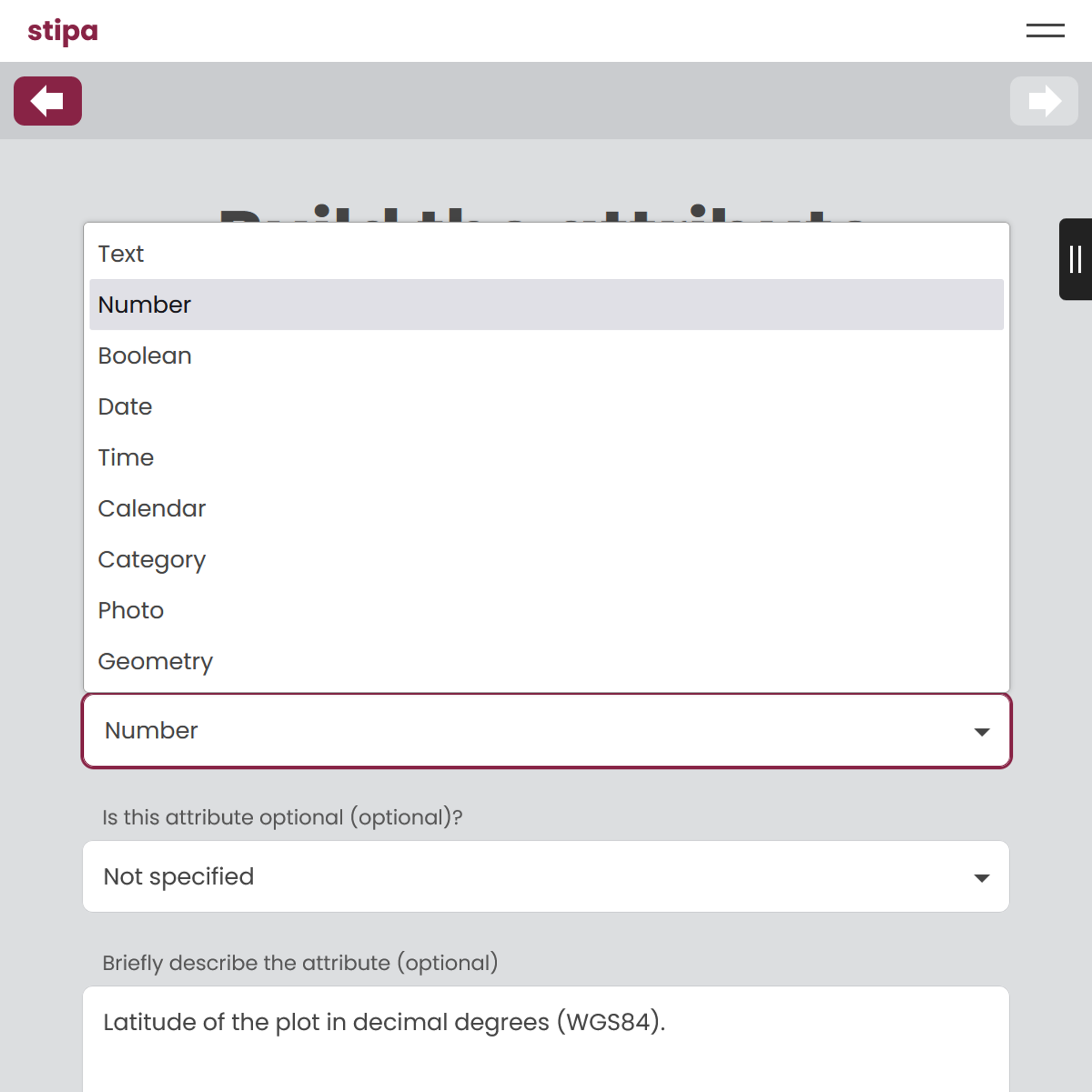
Figure 1. Attribute data types.
An attribute with the Text data type will be given the control shown in Figure 2. This control is a text box that accepts any value up to 1000 characters in length, unless a different maximum length is specified in the protocol. The maximum length determines the height of the text box.
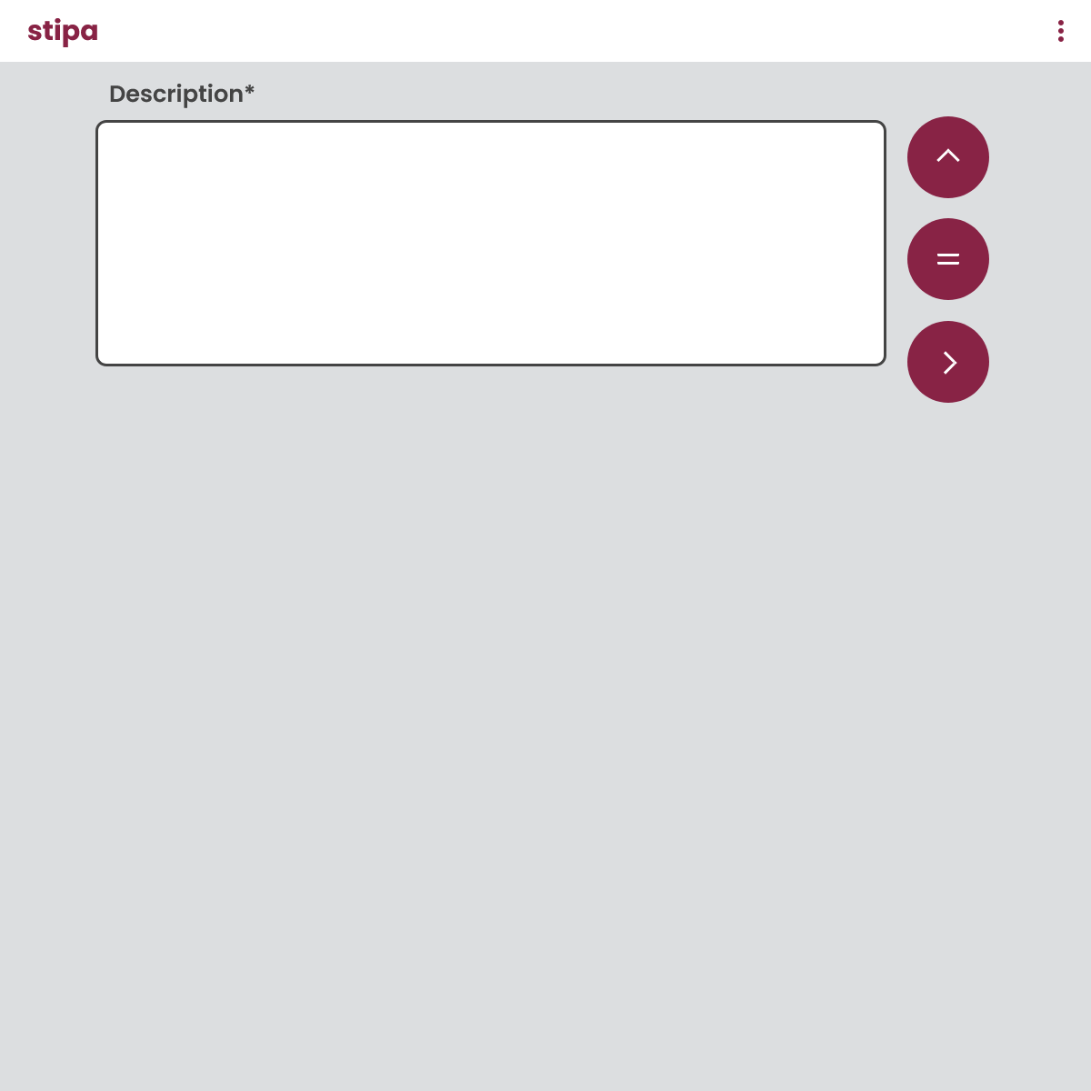
Figure 2. Control displayed for the Text data type. The asterisk at the end of the label indicates that the attribute is optional.
An attribute with the Number data type will be given the control shown in Figure 3. This control is a text box that accepts only numeric values (numbers containing commas are not accepted). An error message will be displayed for non-numeric entries or entries that fall outside of any minimum and maximum bounds specified in the protocol. An increment value can also be specified in the protocol, and the control will then include buttons for incrementing and decrementing the entry. Attributes that require a GPS and clinometer for obtaining measurements can also be assigned the appropriate tool, and a button for loading the tool will be added to the control.
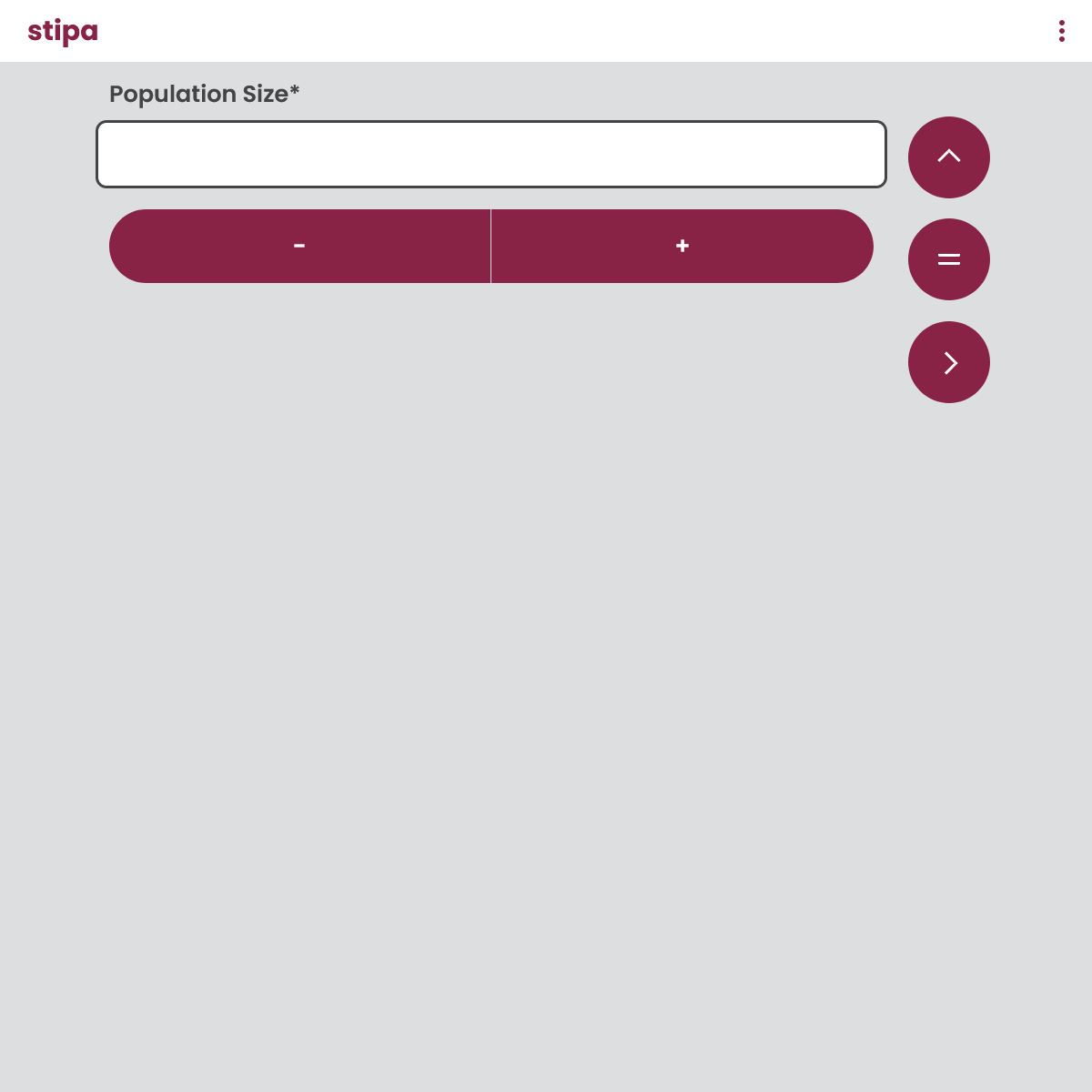
Figure 3. Control displayed for the Number data type.
An attribute with the Boolean data type will be given the control shown in Figure 4. This control includes two buttons for selecting either "yes" or "no". A third option is to de-select both buttons and leave the entry blank.
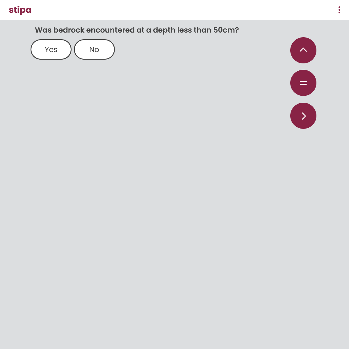
Figure 4. Control displayed for the Boolean data type. In this example an alternative label was specified in the protocol so that the control appears as a question.
An attribute with the Date data type will be given the control shown in Figure 5. This control includes three scrollable menus: one for month, one for day, and one for year. A value of NA can be selected for any of these components if the component is not applicable.
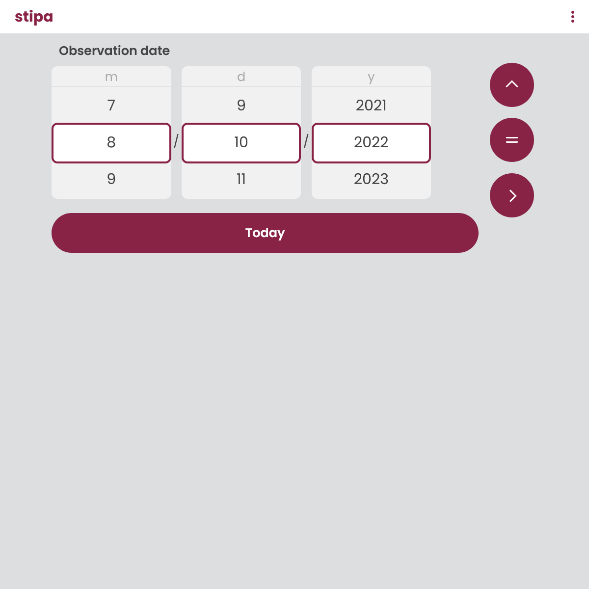
Figure 5. Control displayed for the Date data type.
An attribute with the Time data type will be given the control shown in Figure 6. Similar to the Date control, this control includes four scrollable menus: one for hour, one for minute, one for second, and one for time period (AM or PM). A value of NA can be selected for any of these components if the component is not applicable.

Figure 6. Control displayed for the Time data type.
An attribute with the Calendar data type will be given the control shown in Figure 7. This control is a standard Gregorian calendar displaying the current year and month. Users can choose a date by clicking on the appropriate cell of the calendar. They can also select a different year and month using menus located at the top of the control.
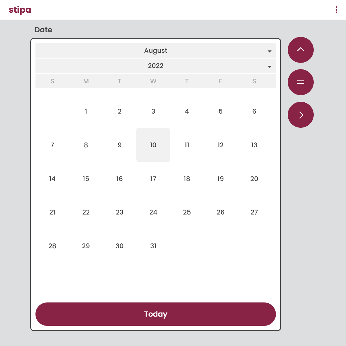
Figure 7. Control displayed for the Calendar data type.
An attribute with the Category data type will be given the control shown in Figure 8. This control is a choice list of categories specified in the protocol. Categories can be attribute-specific or recycled using a shared list. If you assign the attribute both attribute-specific categories and a shared list, both types of categories will be displayed in the control, with attribute-specific categories taking precedence.
Categories are listed in the order they appear in the protocol unless the option to automatically prioritized categories by usage has been set to yes. In this case categories used most often for the project will be moved to the top. Categories resume their original ordering when the project is closed.
Users are allowed to select any number of categories unless a limit is specified in the protocol. Categories selected during data entry are moved to the top of the menu. A search bar is provided at the top of the control for all attributes having more than 40 categories.
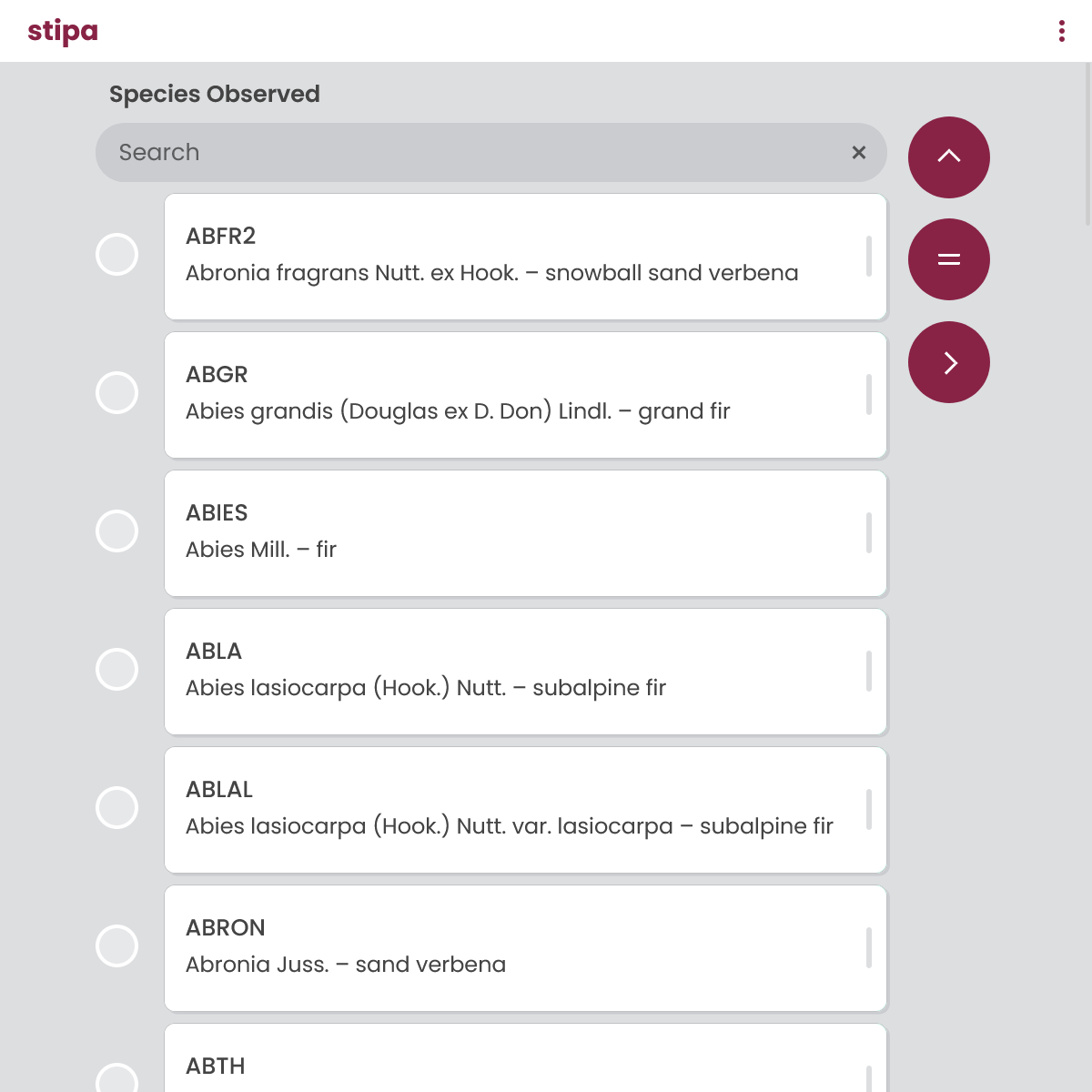
Figure 8. Control displayed for the Category data type.
An attribute with the Photo data type will be given the control shown in Figure 9. This control consists of a button for launching the photo capture functionality of your device. The behavior of the control is device-dependent, but in most cases you will have the option to take a photo using your device's camera or select a photo stored as a file. The photo will be displayed in the control once loaded.
You can delete the photo by clicking on the button located in the upper left corner of the control or download the photo to your device by clicking on the button located in the upper right. You can also replace the current photo with a new one by simply clicking on the control. Only the names of photos captured with this control are included in exported project data; the photos themselves must be manually downloaded to your device.
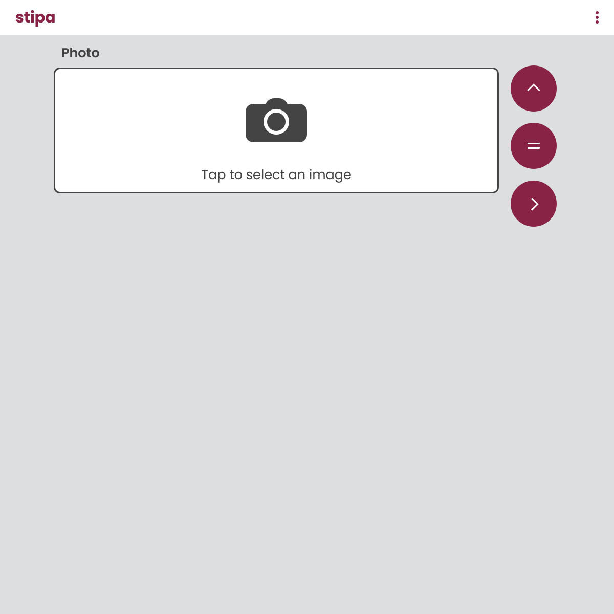
Figure 9. Control displayed for the Photo data type.
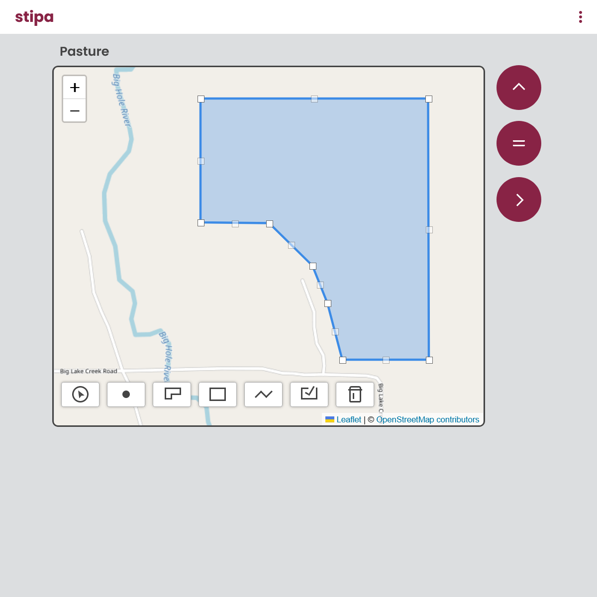
An attribute with the Geometry data type will be given the control shown in Figure 10. This control provides an interactive map for drawing and editing attribute geometries, including points, lines, polygons, and rectangles.
Add a new shape using the point (), line (), polygon (), or rectangle () button. Enable editing of an existing shape by clicking on it. Once edits are complete, click on the commit () button to save your changes. Delete the shape most recently added using the delete () button.
Multiple shapes can be created for a single attribute, and these shapes can be of different shape types. Mixing shape types, however, makes it impossible to edit shapes once they are created.